Posts

Digital Media Final Portfolio

Image
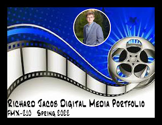
My name is Richard Jacob and I am a freshman at the University of Tampa majoring in Film Production. This is my final portfolio including all my work from the FMX 210 Digital Media class. Throughout the semester, I learned how to use multiple Adobe software programs to create various projects. The programs include Dreamweaver, Illustrator, Photoshop, and InDesign. Throughout my art, I showcase elements from my story, War of Dragons. My favorite project was the business cards and it can be found on page 12. The Business Cards project was created in Adobe InDesign . My least favorite project was the HTML5 Canvas because coding isn't my thing. For the portfolio, I used InDesign to create each portfolio page. Each page uses multiple layers for background, text, images of projects, and page title which makes it easier to go back and make adjustments . I followed a film theme for my Portfolio as my major is film production . I used an analogous blue color palette for my portfolio. I ho

Business Card Project

Image
For the Business Card project, I used Adobe InDesign to create 3 unique personal business cards. I decided to use 3 historical flags from my fictional story, War of Dragons. The color palette for the flags are simple. The three main colors are red, yellow, and blue. Each flag contains my logo in the three main colors. The premise for the business cards is I am a Tour Guide to the Raddmoses Palace following the War of Four Families. The phone number represents a futuristic phone number. The website ends in “.rom” instead of “.com” because the website connects to the Raddmoses planetary network. Likewise, the email address ends in “.rom” instead of “.com” because it’s part of the Raddmoses planetary network. The first business card is the flag of the current ruler from saga #4 which is Queen Nal The flag Val is Queen Nala Raddmoses Flag. The background is yellow with two red triangles with the yellow logo in the middle where the two triangles meet.  The second business card is an origina

Self Portrait and Propaganda Poster Project

Image
The Self Portrait and Propaganda Poster Project had two parts. In Part 1, I took an original picture of myself and used Adobe Illustrator to create a self portrait using the Pen Tool in Illustrator. I chose one of my high school graduation pictures. I chose to create a cartoon image. I found the pen tool a little difficult to use for this project but, I got the hang of it after using it more. The most challenging part was tracing my eyes, glasses, and face.                                                      Original                                           Self-Portrait   In Part 2 of the Self Portrait and Propaganda Poster project, I created a vector illustration using my Self-Portrait and created a Propaganda Poster. I chose to follow the WWII theme for my propaganda poster soliciting people to Enlist Today. I based the propaganda off of my story, War of Dragons. In War of Dragons, the World Forces take on the evil Confederate Union to defend the Earth in a 15 year war. I chose pe

ID Homework #1 - Tutorials

Image
In order to prepare for creating projects using InDesign, I found three beginners tutorials that would help me learn how to use Adobe InDesign.  Below are the three tutorials. The first tutorial is called Learn Adobe InDesign in 9 minutes . The short video describes in depth the basic functions and tools that are contained in InDesign which include creating a new document, setting initial document preferences (i.e. title and units), and how to use Pages, Layers, and Paragraphs. After watching the video, I did not find any tools that would be hard to use as many of them are straight forward. InDesign would be a good tool to use to make posters or pages in magazines. InDesign sounds fun and I am exited to use it. The most interesting thing from the video was how to create pages and layers. The second tutorial was called Adobe InDesign Tutorial for Beginners. The video was a little over 5 minutes. The short video showed how to create text frames, add images, add sidebar text, and how to u

Logo Project - War of Dragons Logo

Image
The Logo Project provided an opportunity to create a logo for myself using Adobe Illustrator. First, I drew 10 possible sketches for my logo. Then I decided on one logo. I knew my logo would be related to my story, War of Dragons. The Logo BW image below is the Black/White image of my War of Dragons logo. Below the BW Image are 3 colored version of my War of Dragons Logo. I really enjoyed this project because I had the opportunity to publish an image I created in 5th grade. I would draw this image in the snow or on paper all the time.  The symbol is the kings seal similar to the US Presidential Seal; whoever was in power would own the seal. Logo Sketches Logo BW Final Logo

Somewhere Project - Star Wars vs War of Dragons

Image
For the Somewhere project, using Photoshop, I took a scene from Star Wars and placed myself into the scene. I chose a scene from Star Wars because it is my favorite movie series. The first picture is the actual Star Wars scene, the second picture is an action picture of myself, and the third picture is the two pictures merged together. In my story, War of Dragons, there are dragons who can control elements. Those who can control all elements are called catalysts. A well known catalyst is named Darcladis, an insane dragon who's fighting style is vicious and unpredictable. Darcladis could easily beat any Jedi in combat. In the consolidated image above I dressed up as Darcladis for a movie trailer project I made in high school. As a Star Wars fan, I used the Jedi as an example and stepping stone in forming elementals and I am very happy to have combined the two into one image. This is where Star Wars meets War of Dragons.

BW to COLOR Photoshop Project

Image
For the BW to COLOR project, I took one of my high school graduation pictures and using Photoshop, I changed the original picture into a black and white image. I created three different colorized versions by applying three different color palettes from color.adobe.com. From color.adobe.com, I choose the Double-Split Complimentary, Analogous, and Compound color palettes. It took me a total of 8 hours over a couple days to complete the project. My first colorized version follows the Double-Split Complimentary color palette. I chose this color version because I liked the colors blue and purple. Being my first version, I found it challenging to get the colors applied to the image. This version took me the longest; about 4 hours. For this version, I chose to make my hair blue and my jacket purple. For both the hair and jacket, I used Quick Selection Tool. The Quick Selection Tool made it easy to select the hair and jacket. My second colorized version follows the Analogous color palette. I